
When you build a predictive model, say, a classifier that scores customers by their likelihood to convert, you need a way to understand where the model performs well and how much better it is than random selection. A decile lift chart is one of the most practical tools for this. It shows how model performance varies across ten equal-sized groups (deciles) of your scored data, typically ranked from highest predicted probability to lowest. For professionals learning evaluation techniques in data analysis courses in Hyderabad, decile lift is a useful bridge between “model metrics” and “business outcomes,” because it directly answers: If I target the top 10% of predictions, what do I gain?
What a Decile Lift Chart Measures
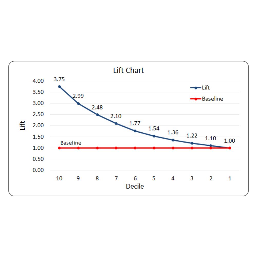
A decile lift chart starts with a simple idea:
- Score every record using your model (probability of event = 1, risk score, propensity score, etc.).
- Sort records by score in descending order.
- Split the sorted list into 10 equal-sized buckets (each is 10% of the data). These are deciles.
- For each decile, calculate the event rate (e.g., conversion rate, fraud rate, default rate).
- Compare each decile’s event rate to the overall event rate in the full dataset.
That comparison is called lift.
Lift formula (per decile)
- Overall event rate = (Total positives) / (Total records)
- Decile event rate = (Positives in decile) / (Records in decile)
- Decile lift = (Decile event rate) / (Overall event rate)
If the overall conversion rate is 2% and the top decile conversion rate is 8%, then top-decile lift = 8% / 2% = 4. That means the top decile is 4× better than average, exactly the kind of “ratio of performance” that decile lift charts highlight.
How to Build a Decile Lift Chart Step by Step
A clean workflow helps you avoid common mistakes:
1) Use the right dataset split
Compute decile lift on a validation or test set, not on training data. Training lift can look unrealistically strong due to overfitting.
2) Decide what “positive” means
Lift depends entirely on your positive label. For churn models, “positive” might be churn = 1. For marketing, it might be purchase = 1.
3) Create deciles properly
Use equal-sized buckets (same number of rows) after sorting by score. If your dataset is small, deciles can become noisy; consider fewer buckets (quintiles) for stability.
4) Add both decile and cumulative views
Two related views are common:
- Decile lift: lift in each bucket separately.
- Cumulative lift: lift considering top 10%, top 20%, top 30%, etc.
Cumulative lift is especially useful for deciding the cutoff for targeting or investigation.
Learners in data analysis courses in Hyderabad often see that decile lift is most actionable when paired with a cumulative curve, because it maps directly to “how many records do we act on?”
How to Interpret the Chart in Real Scenarios
A decile lift chart is best read from left to right (top scores to bottom scores).
A strong model typically shows
- Very high lift in the first 1–2 deciles.
- Lift that declines steadily as you move to lower-scoring deciles.
- Lift near 1.0 in the bottom deciles (performance close to average).
Example: marketing propensity targeting
Imagine 100,000 users and an overall purchase rate of 1%. If the top decile has a purchase rate of 5%, the lift is 5. That’s a clear signal: spending budget on the top 10% gives much higher return than random selection.
Example: fraud or risk review queues
Fraud teams cannot review every transaction. If the top decile captures a large share of fraud cases at high lift, the model helps prioritise reviews. Here, lift helps translate model scoring into operational decisions: “How many cases should we queue today?”
Pitfalls and Best Practices
Pitfall 1: Lift without calibration
Lift can be high even if predicted probabilities are poorly calibrated. Lift is about ranking quality, not probability accuracy. If you need probability trustworthiness, also check calibration plots.
Pitfall 2: Imbalanced or drifting data
If the overall event rate changes over time (seasonality, policy changes, new customer mix), lift values can shift. Track lift monthly and compare like-for-like periods.
Pitfall 3: Leakage and unrealistic lift
If you accidentally include “future information” (like post-event signals) in features, the lift chart may look incredible, but it won’t hold in production. Always validate feature timing.
Best practice: pair lift with business metrics
Use lift to choose a cutoff, then estimate outcomes:
- Expected positives captured
- Cost per action (calls, reviews, discounts)
- Revenue saved or gained
This is where evaluation becomes decision-ready, which is exactly what many practitioners aim for after completing data analysis courses in Hyderabad.
Conclusion
A decile lift chart is a practical, business-facing way to evaluate a predictive model’s ranking power. By comparing event rates across score-based deciles, it reveals the performance “ratio” you get when focusing effort on top-scoring records. Use it on test data, compute lift correctly against the overall rate, and interpret it alongside cumulative lift and real operational constraints. Done well, decile lift charts turn model scores into clear actions, what to prioritise, how much to target, and where the model adds measurable value, skills that directly strengthen real-world evaluation work in data analysis courses in Hyderabad.
Related Posts